
Tools mentioned in this article
Open the browser-based tool while you read and try the workflow immediately.
The same color often appears in multiple formats
Design tools, CSS files, and documentation may use HEX, RGB, or HSL for the same color. Converting between them helps bridge design handoff, frontend implementation, and accessibility review.
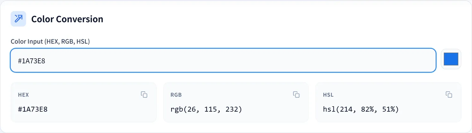
The Color Converter and Contrast Checker converts color formats and helps compare foreground and background colors.
Example: Checking a button’s text color
Say you use the brand color #2563eb as a button background and want white text.
.primary-button {
  background: #2563eb;
  color: #ffffff;
}
Enter foreground #ffffff and background #2563eb into the tool to check the contrast ratio before implementing. If it’s readable, ship it; if it’s low, darken the background, change the text color, or revisit the button size or weight. The same blue made lighter—say #60a5fa—can become hard to read with white text, so verify by the numbers rather than by impression.
Check readability, not just style
A color pair can look attractive but still be difficult to read on mobile screens, bright displays, or low-quality monitors. Check contrast before shipping buttons, labels, links, alerts, and navigation states.
If you are preparing launch assets, use the Favicon Generator after settling on brand colors so icons stay consistent with the UI.
HSL is useful for variations
HSL makes it easier to adjust lightness and saturation for hover states, borders, subtle backgrounds, and disabled states. Convert a HEX value to HSL, adjust it, then use the result in CSS.
.primary-button:hover {
  background: hsl(221 83% 45%);
}

.primary-button-subtle {
  background: hsl(221 83% 96%);
  color: hsl(221 83% 32%);
}
Darkening slightly for hover, raising lightness for a pale background, or deepening just the text color is easier to reason about—and to explain in review—when you keep colors in HSL.
Summary
Color conversion and contrast checking belong together. Converting formats helps implementation, while contrast checks help ensure the final interface remains readable and usable.
Frequently Asked Questions
What contrast ratio do I need?
The WCAG accessibility guidelines recommend a contrast ratio of at least 4.5:1 for normal text and 3:1 for large text (roughly 18pt, or bold 14pt). Interactive elements like buttons and links matter for readability too, so check the numbers with the Color Converter and Contrast Checker before implementing.
When should I use HEX, RGB, or HSL?
HEX (#2563eb) is concise and standard in design tools and code. RGB is handy when you need alpha (rgba). HSL lets you adjust hue, saturation, and lightness intuitively, which is ideal for creating variations of the same color—darker for hover, paler for backgrounds.
Does the same color look different across formats?
The color itself is identical, but HSL makes adjustments like “lower lightness by 5%” intuitive. The key is to guarantee readability with a contrast ratio number rather than deciding by impression alone.